
We rely on data to make decisions, share ideas, and see the big picture of business processes. So, what’s the data on Microsoft Power BI versus Excel?
There are many software options for collecting, organizing, and displaying data. Here’s the basic rundown on Excel and Power BI.
- Excel is a spreadsheet—an application used to organize and analyze data in tabular (table) form. Excel was first released in 1985 and has been the industry standard since the 1990’s.
- Power BI is a business analytics service—it stores data, supports interactive visualizations. Power BI was based on Excel capabilities, plus has a host of its own features. It was first available to the general public in 2015.
With both of these Microsoft 365 (previously Office 365) applications at your fingertips, which one should you use for your next project?
To start, ask yourself: What will you do with the data afterwards?
When to use Power BI
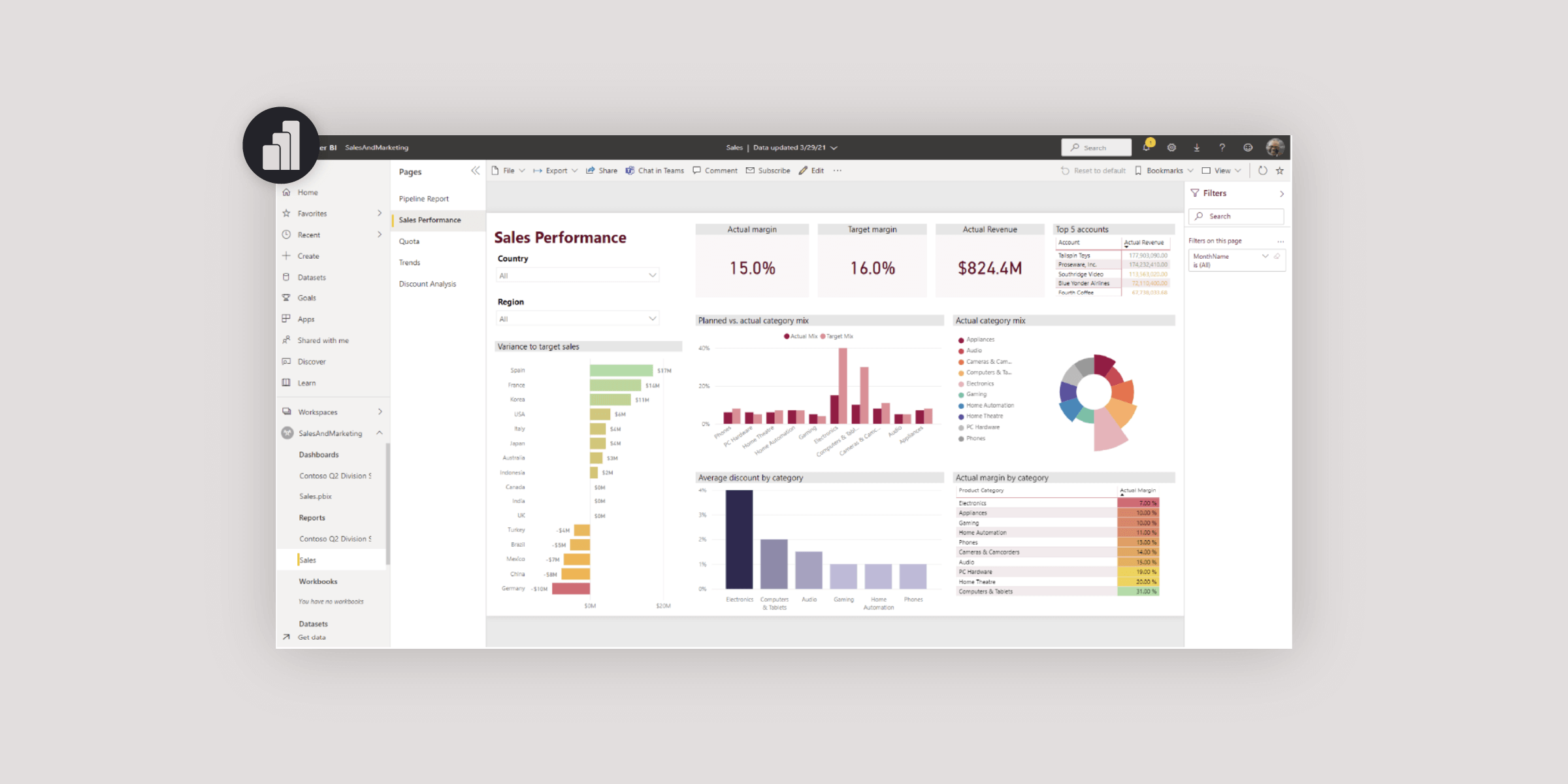
To reiterate, Power BI is a business intelligence and analyzation application. You’ll use Power BI to chart progress, compare data points, and make informed business decisions with one or many data sources.
Power BI’s strength is the ability to create rich visualizations that can transform data into insights in a scalable format. With this full-service solution, software users can extract data from multiple sources, transform and cleanse the data, and then create a data model for building visualizations.
The best part?
After designing a report, simply refresh the data and your visualizations are updated. It might be more work up front to put together a report, but once the data refresh has been set up, there’s no need to touch it again.
Analyze large amounts of data
As to what you’ll do with the data afterwards, consider the data size. If you are dealing with many columns or rows (e.g., thousands or even millions), go with Power BI.
Keep in mind: after you import data, it isn’t easily altered. In fact, after you publish and share, recipients can’t access or change the data. Recipients will only interact with visualizations.
Power BI also supports real-time data streaming. Examples include usage service metrics, social media, factory sensors, or other transmitters.
Create rich data visualizations
Transform your business data from raw numbers into visuals. Unsurprisingly, visuals help portray the bigger picture of performance, trends, and interactions. They also help viewers spot significant insights, track progress over time, and make informed business decisions.
In Power BI, standard visualization options include bar graphs, line charts, scatter plots, geography maps, pie charts, and calendar displays. It’s also easy to find and import more visualizations. Once you’ve chosen a visual, you can customize the colors, X and Y axis, size, placement, labels, and so on.
Finally, some visualizations include artificial intelligence capability, which can quickly highlight trends, anomalies, and even forecast your data. AI can be a big timesaver when hunting for insights.
Interact with data
When you build a visual, Power BI provides many ways to interact with the data and get the insights you’re looking for. When clicking on elements in the visual, Power BI will filter data based on the selected element(s).
Here are some additional interactions:
- Drill mode. If your data has a hierarchy, try drilling down to reveal additional details. Drilling works with categories and subcategories. For example, you could drill down into a list of vehicles by make, then by model, then color, and so on.
- Filters. Use the filter pane to interact with data by values (e.g., greater than, equal to, specific categories, etc.). Save your changes to filters and come back to them later.
- Slicers allow you to filter information by showing narrow portions of data from other visualizations. For example, if you prepared a report on book sales you could use filters for weeks sold, and then slicers for certain books.
Share reports with larger audiences
When your data is ready to go, you can share reports, dashboards, workspaces, or apps.
If you are sharing with other users that have Power BI licenses, sharing is backed by Microsoft 365 security. Simply grant or revoke access at any time. Once you share, you can collaborate and share insights across other Microsoft apps like Teams and Excel. You can also share on websites, SharePoint ,Power Apps, and so forth.
NOTE: When you share reports and apps in Power BI, you aren’t sharing a file with all its data. You are sharing visuals that interact with the data in the cloud.
Integrate reports and visuals into other applications
Another valuable feature in Power BI is the capacity to embed interactive reports and visuals into web, desktop, or mobile apps. Security settings carry over, so users can log in before viewing reports.
For example, you could embed your real-time data within your CRM application to give your sales team everything they need in one place.
Access data on the go with mobile devices
Power BI reports and dashboards are mobile-friendly. From wherever you are, get business insights on your tablets and smart phones. Create a mobile version of your dashboards to easily review your data when you are away from your desk.
Track your data
Dynamic data changes with time. Power BI is helpful for time intelligence, comparisons, year to date, and more.
With Power BI, you can boost the longevity of your reports—a valued capability if you present to a bunch of different people on a regular basis. Publish a Power BI report, share it with your audience, and then refresh the data regularly.
If “regularly refresh the data” sounds troublesome, you can schedule ahead to refresh data on a cycle. How you set up the refresh depends on your data source.
Finally, set alerts to receive an email when the data changes beyond your specifications. You can set alerts on tiles, dashboards, and visuals.

When to choose Excel
Excel is a justifiably popular spreadsheet program used across many organizations in a variety of ways. Stick with Excel when you need to:
Add frequently updated visualizations to PowerPoint
If you want to add a chart or other visualization to your next PowerPoint presentation, then Excel is the place to start. To get started, copy the chart in Excel, and then paste it into PowerPoint. Choose one of the Linked data paste options to keep the chart connected to the Excel source
What if the data is updated frequently? No problem. Just refresh the link to the Excel file.
Access data in a tabular format
When you need to work with data in a table, then Excel is the way to go. Keeping data in a spreadsheet makes it easy for people to find information within clearly organized data. For example, set up data in Excel to use with tools like Mail Merge in Word.
If you format your data as a table, you can sort or filter the information quickly. Plus, you can easily format the table, the headers will stay on the screen as you scroll, and you can also create PivotTables.
Manipulate or change the data
Excel is set up for accessible and easily updated data.
Need to tweak cells to update any connected charts, pivot tables, or formulas? No problem in Excel. By contrast, you cannot manually enter data into Power BI.
Takeaway: If you need to do any manual data entry, then Excel is for you.
However, be careful how you share your data. Consider whether you want others to edit the Excel spreadsheet. If you don’t want the data altered, then Power BI could be the better choice.
Annotate cells
To make a note or comment on specific cells, use Excel. Right-click a cell and choose either New Comment or New Note.
Comments have a reply box and can become virtual conversations. You can @mention colleagues in a comment to show them the exact spot you’re talking about. Notes are uncomplicated text boxes that cannot be replied to—great for reminders or annotations.
Make a quick calculation
Whenever the idea strikes, you can set up fast calculations in Excel. Whether it’s a small or large project, Excel lets you quickly find the total, difference, average, and more. You can also set up charts and visuals from that data.

So, before you dive into your next data project think about what will you do with the data afterwards? Then you can pick the best application from the get-go.
Want to keep current with topics like Microsoft 365, software adoption, cyber security, and more? Subscribe to the blog.

.jpg)